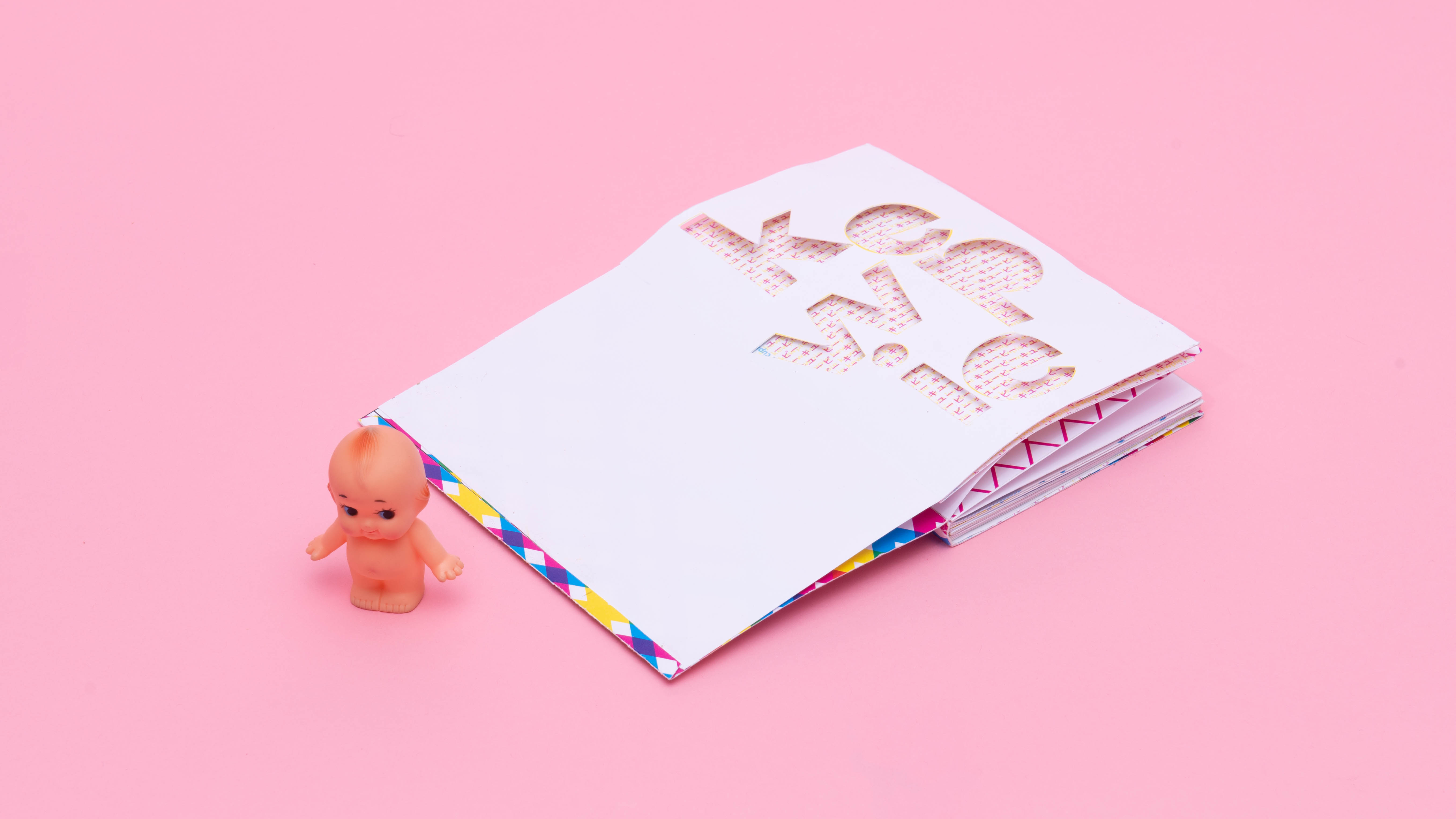
KEWPIE ZINE
Explorations
Book Design
A 32-page zine documenting the exploration of a singular object through graphic shapes, typography,
and photography. The chosen object is Kewpie Kewpie is a brand of dolls and figurines that were comic
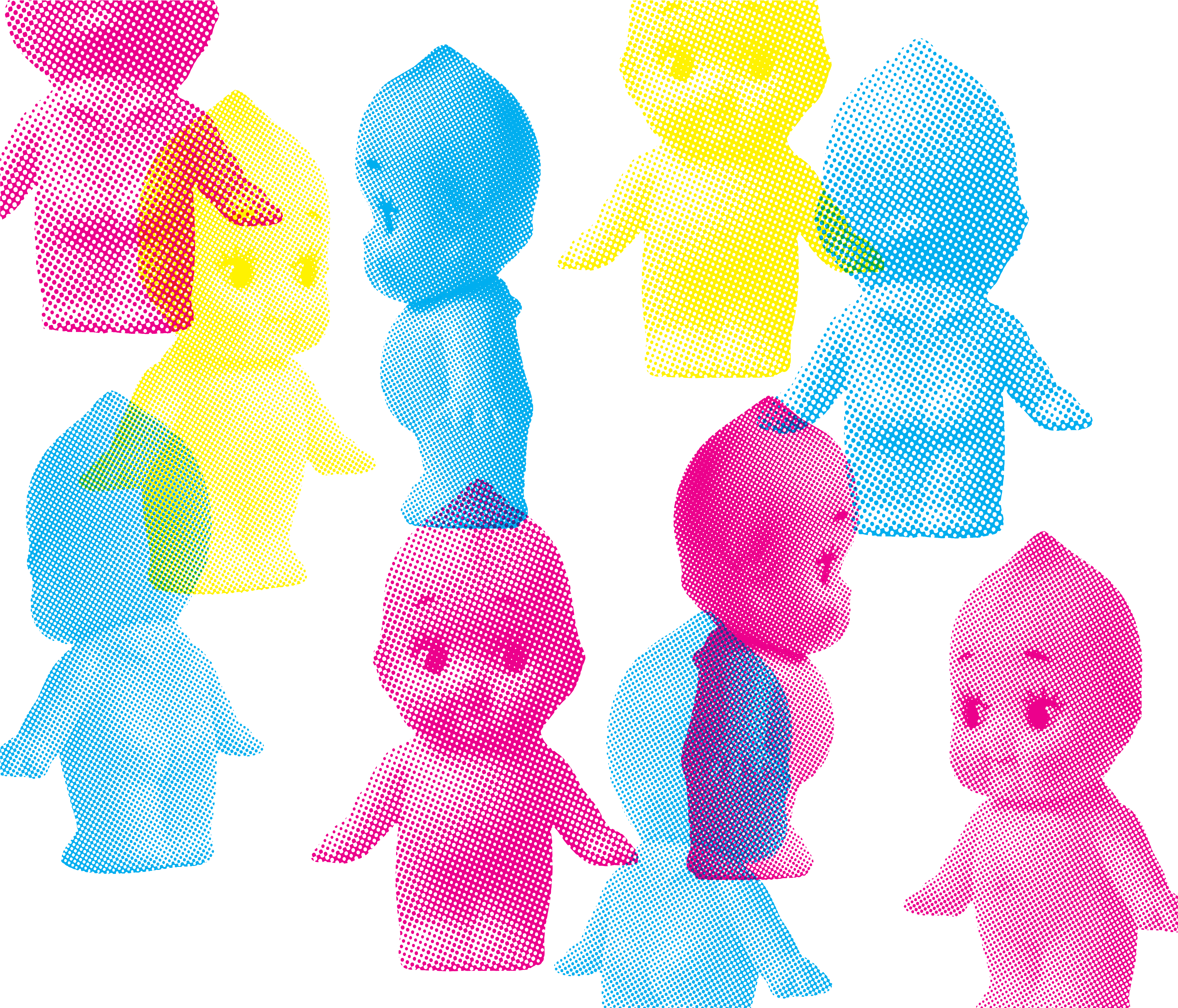
strip characters in the early 1900s, but it is also the mascot of a Japanese brand of mayonnaise. They typography explorations explored the letterform “Q” and “P” since when you combine it together (”QT”). it sounds similar to “kewpie”The last page is a pop-up figure of the Kewpie baby in size. The photography illustrations were convereted to half-tone textures to replicate the riso printing that originated from Japan, and paying homage to the Japanese mayo brand.